In the workspace health you will find an overview of the cross-team results, which are shown in various diagrams.
Filter groups of teams
If you have defined groups of teams, the dashboard offers filtering by these groups of teams. You can filter only those groups of teams in which at least 3 teams that are not excluded from the workspace have participated in the workspace health rotation. Groups of teams with 2 or less teams are accordingly not selectable in the filtering:
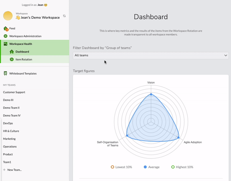
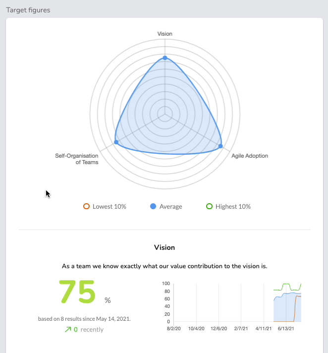
Spider chart & individual values
The spider chart shows average values across the categories of the items. In addition to the average, the highest and lowest 10% can be displayed.
Below this, the individual values per category are listed. In addition to the current average and trend on the left half, the graph on the right also shows the time history with average and top/bottom 10%:
Heatmap
The results of the teams per item are shown in the heatmap by category.
- Gray tiles have no current data points.
- Colored tiles are based on the current average.
If you move the mouse pointer over a tile, the average is displayed. With a click, the individual results over time are shown under the heatmap.
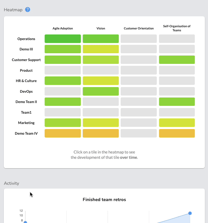
Depending on the settings of the workspace, the heatmap may be turned off to further protect the anonymity of the teams.